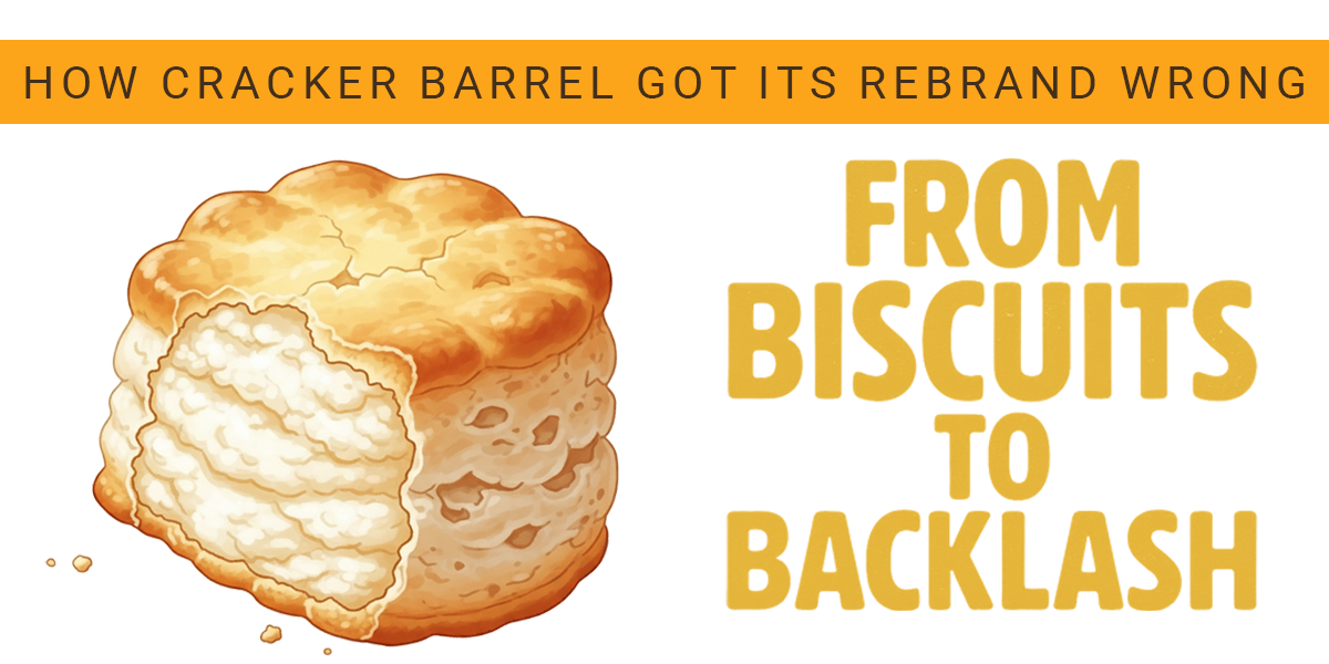
Cracker Barrel isn’t often in the headlines. For decades the chain has been a dependable highway stop for biscuits, rocking chairs, and nostalgia. That quiet brand stability shattered in August when the company unveiled a new minimalist logo, stripping away its signature image of an old man leaning on a barrel. The intent was clear. Executives wanted to modernize a brand often tagged as outdated and broaden its appeal to younger diners. The result was anything but. The new look—a plain, text-only wordmark—was blasted by customers, mocked online, and politicized within days. For loyal fans, it felt like the company had erased its own history. By the end of August, management reversed course and restored the original logo, admitting the rollout had gone too far, too fast. The backlash was not just aesthetic. The chain lost hundreds of millions in market value during the uproar. Influential shareholders called for leadership changes. Politicians weighed in. And most importantly, everyday customers felt alienated. That’s the lethal mix that turns a rebrand into a full-blown crisis.
Why This Misstep Matters
Brand identity is not decoration. For companies like Cracker Barrel, symbols carry emotional weight. The “Old Timer” logo told a story of heritage, family road trips, and comfort food. Removing it overnight broke that bond. Other corporations have learned this lesson the hard way. Gap’s 2010 logo lasted just six days before customer fury forced a retreat. Tropicana’s packaging overhaul in 2009 was so confusing that sales fell 20 percent in two months. More recently, investment firm Aberdeen tried to “modernize” its name to “Abrdn,” only to be ridiculed. In each case, leadership mistook radical change for progress—and paid the price.
The Playbook for Doing Better
Protect what’s iconic. Some assets carry too much equity to scrap. Cracker Barrel’s barrel wasn’t just a design—it was shorthand for everything the company stood for.
•Test before launch. Walmart’s 2008 logo update worked because it was evolutionary, not revolutionary.
•Frame change as continuity. Starbucks dropped “Coffee” from its logo in 2011 but positioned it as an expansion of its story, not a rejection of its past.
•Prepare for pushback. Every rebrand sparks debate. Smart companies anticipate questions and have clear communications ready.
•Anchor in authenticity. Cosmetic shifts that chase trends—like Abrdn’s vowel-free makeover—ring hollow.
The Bigger Picture
Rebranding is high-stakes work. Done right, it signals relevance to new markets. Done wrong, it erases trust in days. Cracker Barrel’s stumble is a reminder that brands live in memory and community, not in boardroom slide decks. Executives can spend millions chasing a new look, but if they don’t bring customers along, the result is backlash—not renewal.
WSI’s Perspective
At WSI, our in-house marketing team has seen this pattern before. Rebrands fail when they ignore story. Our differentiator is simple: we don’t just market jobs, we craft narratives that resonate with workers, employers, and communities. Whether it’s telling a story of heritage, shaping a new brand identity, or protecting the equity that already exists, WSI approaches marketing with the same mindset we bring to staffing—listen deeply, translate clearly, and deliver strategies that stand the test of time.

